
Resources
The Breakdown
Important
- Statistic – This refers to a summary of a sample that is taken from a population.
- Parameter – This refers to a summary of the entire population. When you have the whole population in a study, there is no need to conduct statistical tests.
- Distribution – This displays how observations are spread across a possible range of data.
- Frequency table – This is a method for summarising a dataset by displaying the frequencies and percentages associated with different categories, intervals, or values within the data. To create one, you should first order values from low to high (or group them if there are many values), then count the frequency of each value and provide corresponding percentages. Cumulative frequency and percentage can also be reported.
- Ordering data for median and quartiles – When computing the median, it is necessary to first organise the data from low to high. Similarly, for calculating quartiles (Q1, Q2, Q3), the values must be ordered from smallest to largest.
- Skewed Distributions –
- Positively skewed (right-skewed): The distribution exhibits flatness or skewness on the right or positive side, with most observations concentrated on the left or negative side. In this case, the mean is typically larger than the median and mode because extreme, larger observations impact the mean’s calculation.
- Negatively skewed (left-skewed): The distribution shows flatness or skewness on the left or negative side, with most observations on the right or positive side. Here, the mean is typically smaller than the median and mode because extreme, smaller observations influence the mean’s calculation.
- Normal Distribution – This is a type of distribution where the mean, median, and mode are approximately equal. Additionally, the distribution is symmetric, meaning both sides (left and right tails) are almost identical.
Core concepts
- Why Statistics – Statistics are important for quantifying and describing human behaviour, emotion, and cognition, as well as for inferring quantities of these behaviours through statistical tests.
- Branches of Statistics –
- Descriptive Statistics: This involves summarising and displaying data and presenting relationships or trends within a sample.
- Inferential Statistics: This involves making inferences and generalising data to the broader population through significance tests.
- Central Tendency – This refers to statistics used to present the centre or location of the values in a distribution. The primary measures include mode, median, and mean.
- Mode: The most frequent score or value in a dataset. It only shows the most frequent value, may have multiple or no modes, does not represent the magnitude of the data, and ignores less frequent data.
- Median: The middle score or value in a dataset, where half of the observations are greater and half are less than it. It shows the middle location of the dataset, depends on position rather than magnitude, is not impacted by extreme observations, but is not stable from one study to another.
- Mean: The sum of the scores divided by the number of observations (N). It depends on the magnitude of the data more than position, is impacted by extreme observations, is a more stable measure compared to the median and mode, and is considered a better measure to estimate sample central tendency for population comparison.
- Weighted Mean: Used when assigning different weights or levels of importance to data or values. The formula is the sum of (data points multiplied by their corresponding weights) divided by the sum of the weights. Weights can be percentages, proportions, sample sizes, or frequencies.
- Variability – Also known as dispersion, this concept presents the degree to which individual observations are clustered or deviate from the mean. It is important for quantifying how data points differ, identifying data patterns (e.g., outliers), and checking data consistency.
- Range: The difference between the maximum and minimum values in a dataset. It is a simple indication of the distance between extremes.
- Quartiles: Values that divide a dataset into four equal intervals. Q1 (the lower half) represents the 25th percentile, Q2 (the median) represents the 50th percentile, and Q3 (the upper half) represents the 75th percentile. Q2, being the median, is a direct measure of central tendency.
- Interquartile Range (IQR): The difference between Q3 and Q1 (IQR = Q3 – Q1), which measures the spread of the middle 50% of the data. It is used to detect outliers. A small IQR indicates less spread, meaning data points are close, while a large IQR indicates more spread and a wider range of values.
- Variance: The sum of the squared differences between each data point and the mean of the dataset. It is denoted as s² for a sample and σ² for a population. Variance is highly sensitive to outliers because its calculation includes every single observation, leading to higher variance with extreme values. For sample variance, Bessel’s correction (n-1 in the denominator) is applied to prevent bias.
- Standard Deviation (SD): The square root of the variance. It is denoted as s for a sample and σ for a population. Like variance, standard deviation is highly sensitive to outliers as extreme observations increase the squared deviations from the mean, resulting in a higher standard deviation.
- Statistical Symbols –
- Sample Mean: ҧ𝑥 or M
- Sample Standard Deviation: s or SD
- Sample Variance: s²
- Population Mean: μ (mu)
- Population Standard Deviation: σ (sigma)
- Population Variance: σ²
- Sum: Σ (sigma)
- Number of Observations/Sample Size: n
- Data Points/Values/Scores: x
- Data Visualization – This is a tool or method to increase understanding and communication of data and their patterns. It is important for simplifying data, showing patterns, trends, and relationships, providing a faster way to show results, and aiding decision-making. Effective data visualisation should be clear and simple, accurate, use a proper visualisation method, and have appropriate colours and labelling for axes.
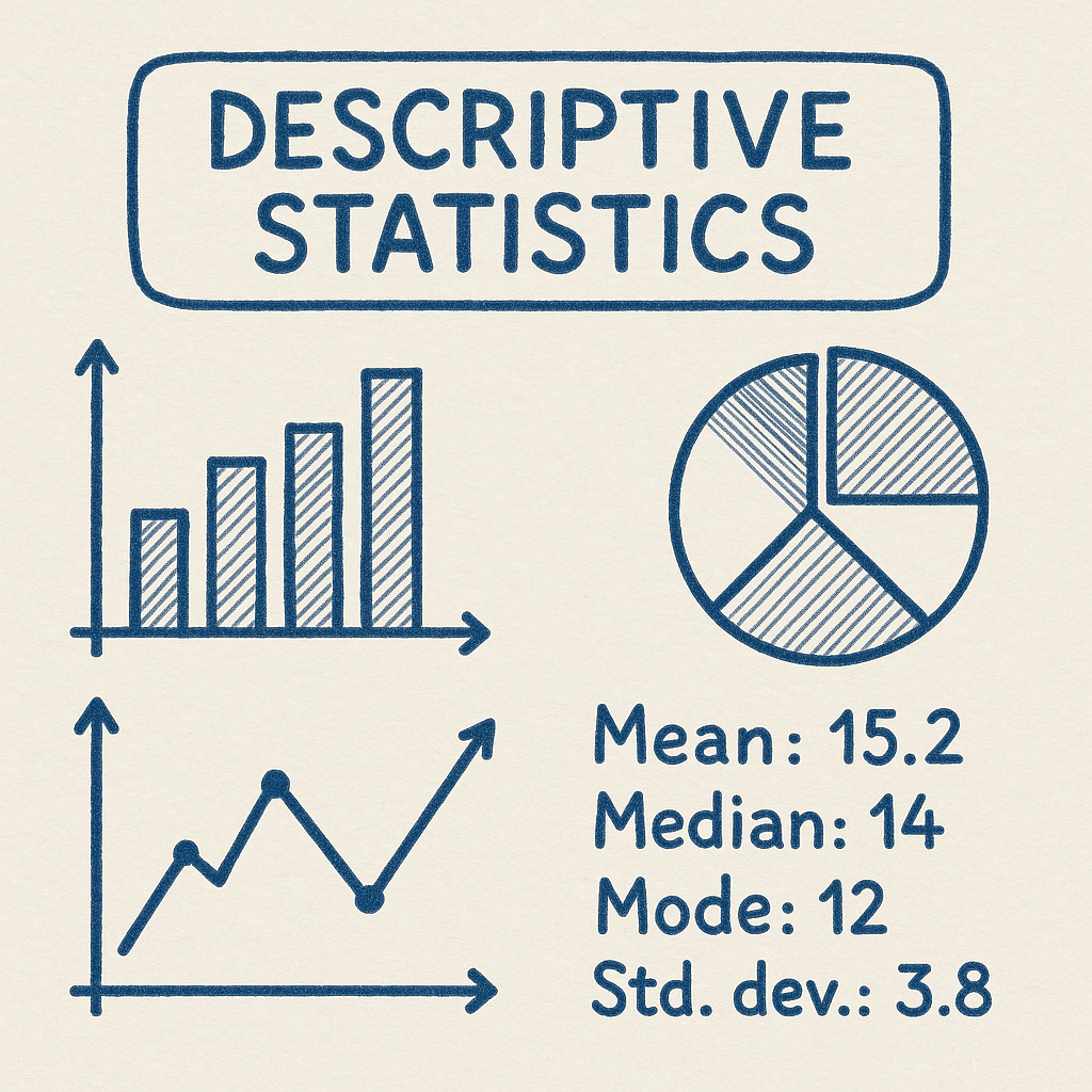
- Types of Data Visualisation – Data can be visualised through tables (e.g., frequency tables, tables showing mean, SD, min-max) and graphs/plots (e.g., histogram, line graph, bar graph, pie chart, scatter plot).
- Frequency: A value indicating how often something appears within a specific dataset.
- Percentage: A number expressed as a fraction of 100 (% = (x / n) * 100).
- Cumulative Frequency and Percentage: The total of percentages or frequency in a distribution, obtained by sequentially adding up the percentage or frequency of each category.
- Bar Graph: Typically used for categorical data (qualitative data), showing frequency, percentage, or mean scores for different categories. There are typically small gaps between the bars.
- Line Graph: Used to display trends, often for longitudinal studies to show changes over time.
- Histogram: Used for quantitative data when the number of observations is large to display the distribution shape. Unlike bar graphs, there are no gaps between the bars in a histogram because the data points are continuous.